
INDUSTRY
GRAPHIC DESIGN
TERM
2023/24 SPRING
COURSE
GRAPHIC DESIGN
SUBJECT
PACKAGING DESIGN

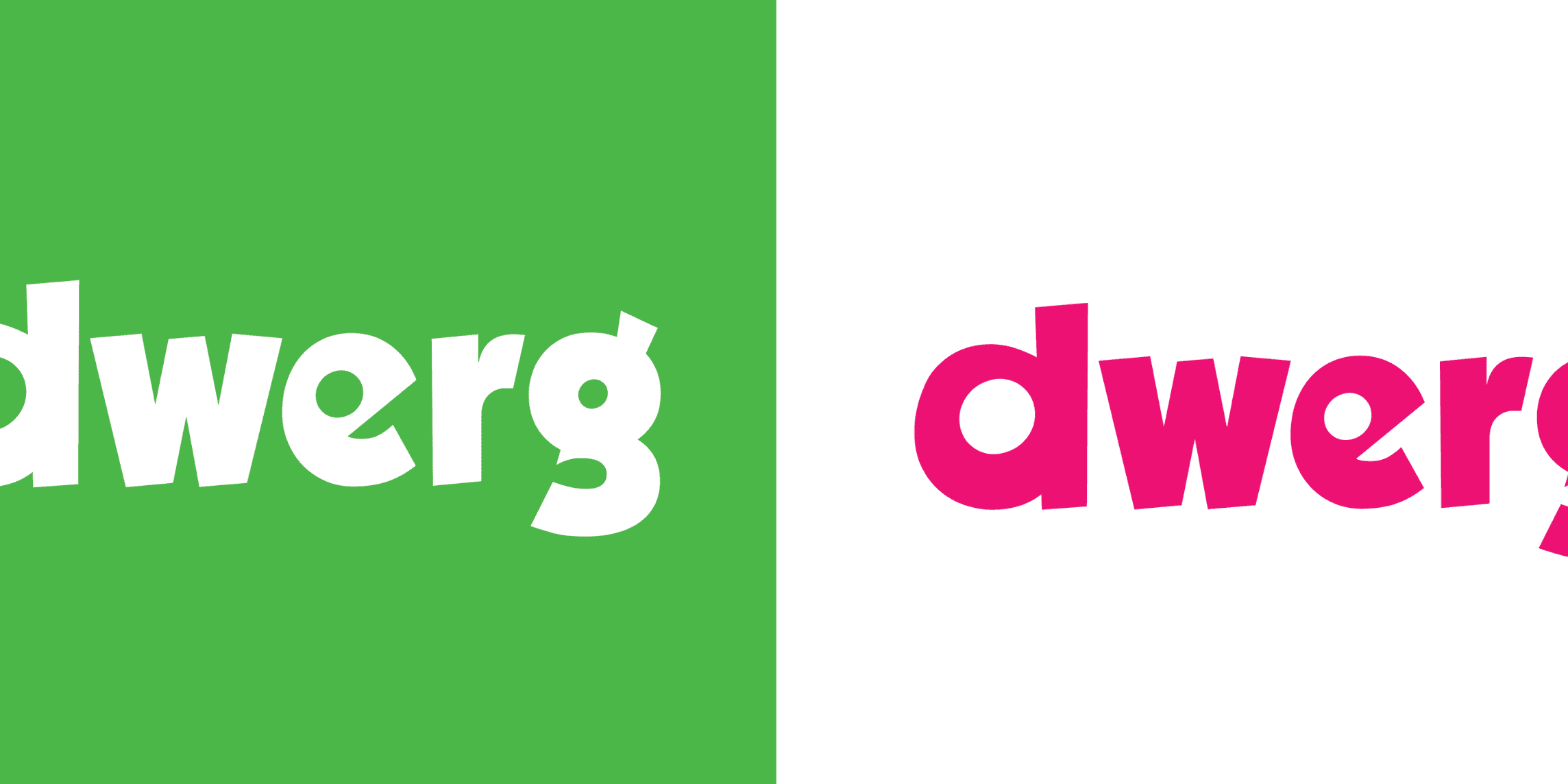
dwerg
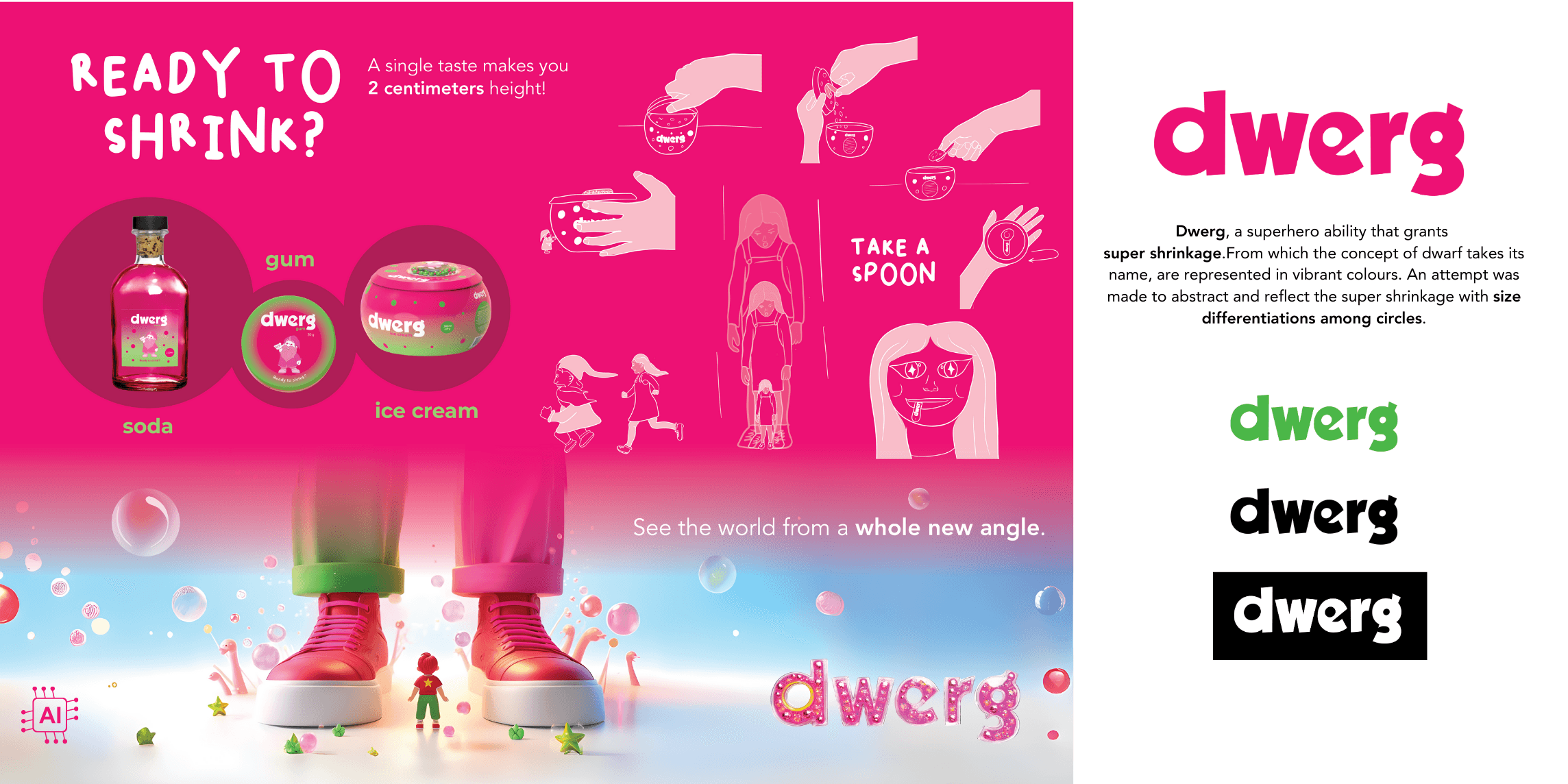
a fictional brand
About
Dwerg is a visual identity and packaging design project created as the final submission for the Graphic Design course. The assignment required designing a visual identity for a fictional brand that enhances a human ability or grants a nonhuman (superhero) ability. Based on this brief, I developed Dwerg, a brand built around the concept of shrinking, with a visual identity and packaging design that reflects this transformative power.
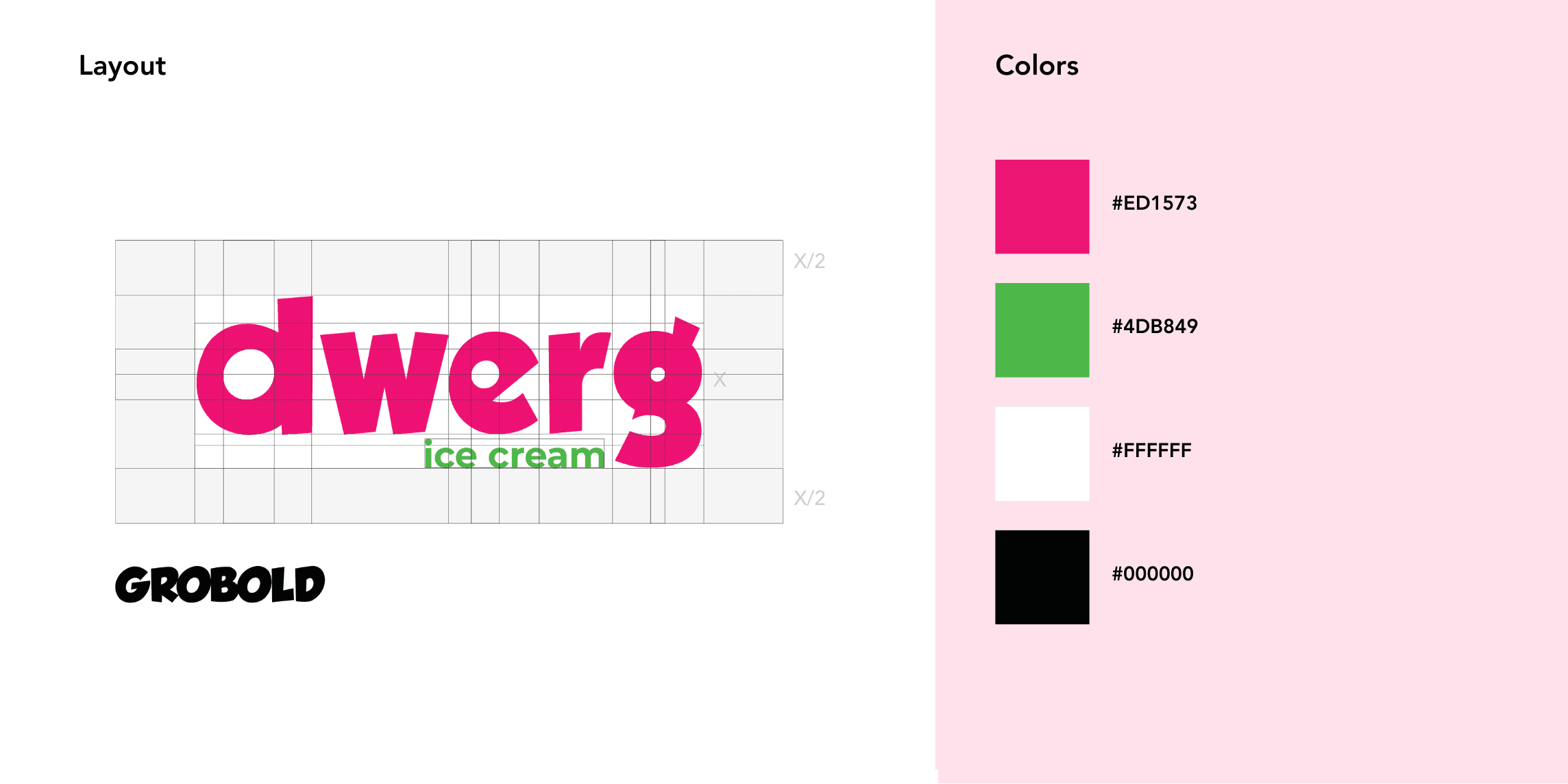
Logo & Color Palette
Inspired by the word “Dwerg” (meaning “dwarf”), the logo design and color palette emphasize playfulness and energy. The vibrant color palette was chosen to create a dynamic and engaging visual language, while maintaining strong contrast for clarity and impact.
In the typographic approach, I incorporated modular circular forms that progressively shrink, creating a visual metaphor for the shrinking superpower. This reinforces the brand’s core identity while adding a sense of motion and transformation to the design.
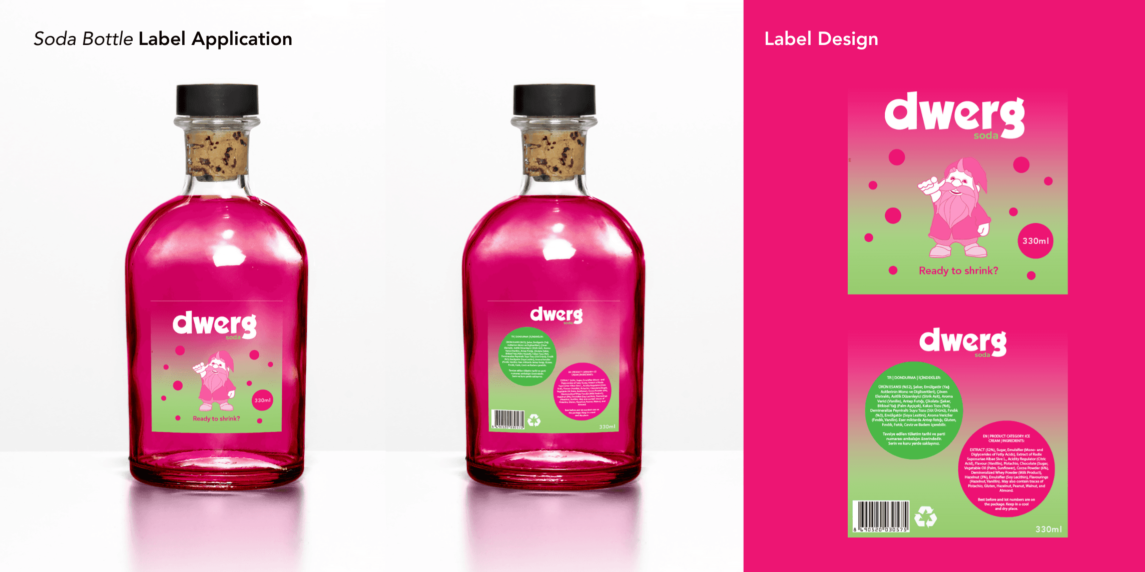
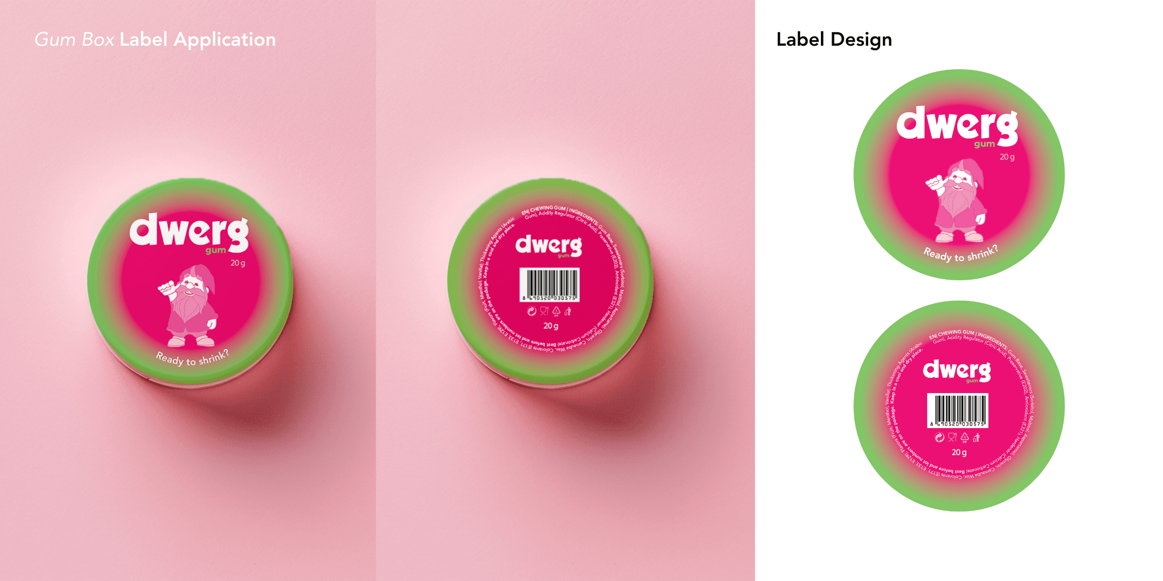
Label Design
The project consisted of two phases. First, I designed labels for pre-existing mockups to reflect the brand’s visual identity. The first mockup product was a soda bottle shaped like a potion bottle, while the second was a circular gum container.
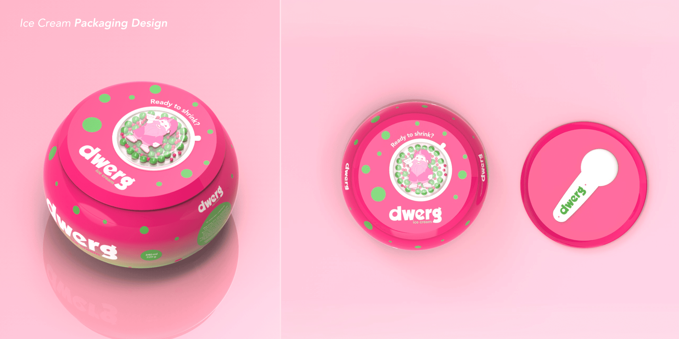
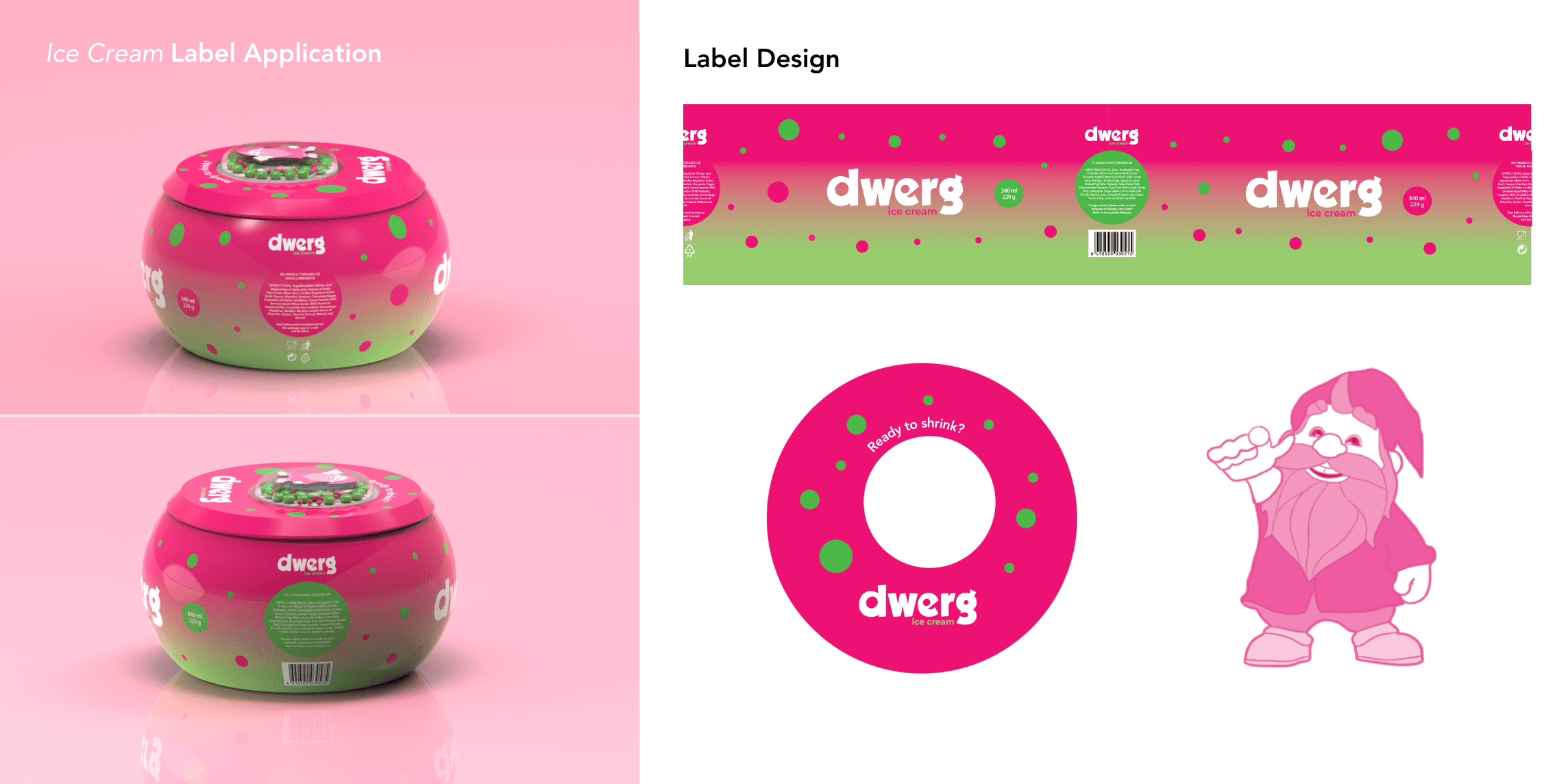
Product + Label Design
The second phase involved designing both the product and its label from scratch. I approached this phase with a focus on the eating experience (see the second image from the top). For the product, I chose ice cream, utilizing its spherical form and matching the sugar sprinkles on the packaging with the circular elements from the label design, creating a cohesive visual language.
This project felt the most personal and reflective of my identity as a designer. It allowed me to merge playfulness, form, and user experience into a unified concept.
The line between reality and fantasy is where creativity thrives.

Tim Burton
Film Director

